Studio A3 by zSpace: Enhancing Education with AR/VR.

Company: zSpace, Inc
Role: Lead Visual Designer
Focus: Visual Design, Ui Design
How can technology deepen understanding and engagement in the classroom?
With zSpace Studio A3, we explored this challenge by enhancing a tool designed to bring immersive learning experiences to life. As the company’s flagship app, it came bundled with their hardware and was already used by thousands of educators and students. My role as lead visual designer was to partner with engineers and product managers to refine the application and create a more intuitive experience.
A Vision for Greater Impact
zSpace Studio empowers educators with interactive 3D models, offering students hands-on learning opportunities in subjects like biology, physics, and more. Inspired by user feedback on usability and interface challenges, we saw an opportunity to amplify its impact.
The app had incredible potential: it was included with every zSpace hardware package and was widely adopted in classrooms. However, educators shared that some processes, like building activities and browsing models, felt cumbersome. This feedback made it clear that streamlining these experiences could make the app even more powerful. We envisioned a redesign that would simplify workflows, modernize the interface, and ensure the app remained a cornerstone of immersive education for years to come.
Designing with Care for Thousands of Users
One of the most significant challenges was ensuring that changes didn’t alienate existing users. With thousands already relying on the app daily, drastic updates that weren’t intuitive could backfire. To strike a balance, I immersed myself in the application—exploring its features, making mistakes, and reflecting on how I expected it to work.
This hands-on approach became a cornerstone of my design process. I conducted informal usability sessions with a few people, observing how they navigated the app and what slowed them down. These insights helped me map out user flows and identify pain points, which then guided the creation of low-fidelity mockups. Each iteration brought us closer to a solution that felt familiar yet significantly improved.
To make the app more intuitive and efficient, we focused on three key areas:
Simplifying the Activity Building Process
Model Browsing
Enhancing Model Interactions
Redefining the Activity Creation Process
Teachers shared that creating lessons was one of their most time-consuming tasks. I started by breaking down the activity creation workflow, identifying opportunities to simplify and streamline each step. The final design introduced:
Slide Builder: A drag-and-drop interface for designing dynamic, presentation-style lessons.
Notebook Builder: A streamlined way to craft interactive questions and multimedia content.
Activity Gallery: A curated library of pre-built activities to jumpstart lesson planning.
Screenshot of classic zSpace Studio with activity builder open before the redesign.
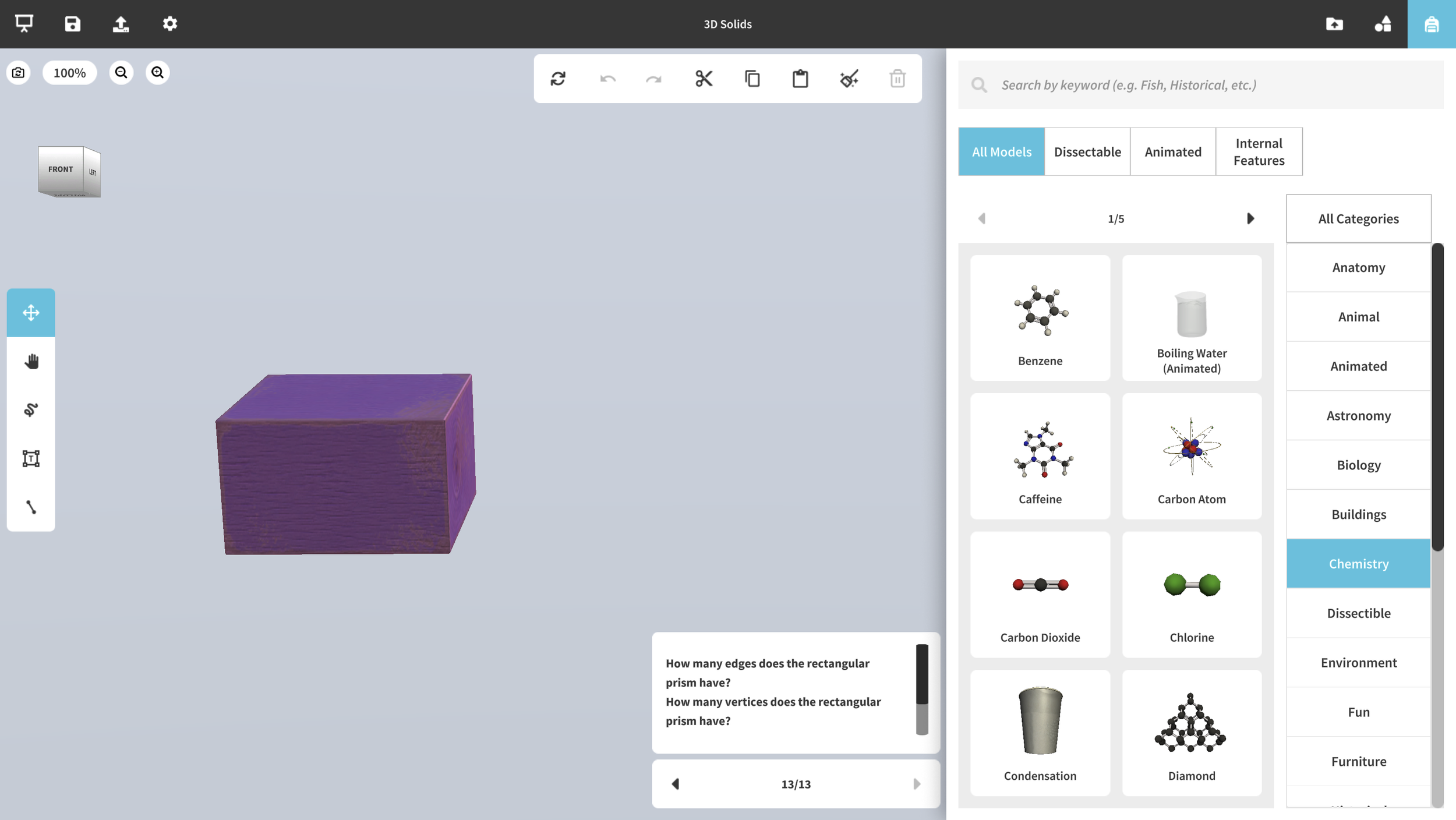
The slide builder was created to make it easy to design dynamic activities in a presentation style. It enables the creation of various scenes for engaging learning experiences.

Screenshot of Studio A3 activity about prisms & shapes. Slide builder is open.
In parallel, the notebook builder offered an interactive platform for generating questions and answers, allowing for the incorporation of text, images, and multiple-choice options. We cleaned up the user interface to reduce cognitive load when creating activities.

Screenshot of Studio A3 with notebook builder open. Text & image answer types are selected.
Meanwhile, the activity gallery functioned as a centralized repository of pre-existing activities, making it easier for educators to find and use relevant content.

Screenshot of Studio A3 with activity gallery open.
By grouping and categorizing functions based on their relevance, the redesigned interface allowed educators to build activities more efficiently and confidently.
Reimagining Model Browsing
Browsing for the right 3D models was another friction point. I envisioned a more visual, intuitive experience that would:
Introduce a visual model gallery for quick navigation and selection.
Enable drag-and-drop placement for arranging models directly into lessons.
Add a model import feature, empowering teachers to personalize lessons with their own content.

Screenshot of classic Studio with the backpack (model inventory) open.
We completely transformed the model browsing and selection process. With the introduction of a more intuitive model gallery and enhanced search tools, teachers and students can now quickly find and access the models they need without hassle. While the option for fixed model placement remains, teachers and students now have the added freedom to drag and drop models anywhere within the scene, offering greater flexibility and control. This update not only streamlines the process but also encourages teachers and students to personalize their workspaces, making interactions smoother and more dynamic.
Screenshot of Studio A3 with model gallery open.
A model import feature was also introduced, allowing teachers and students to bring their own models into the app. This addition enhanced flexibility and empowered teachers and students to personalize their learning experience, making the platform more adaptable to individual needs.

Screenshot of Studio A3 with the import dropdown menu open.
These improvements made it easier for educators to integrate the exact models they needed, reducing frustration and saving valuable time.
Expanding Accessibility
The app's reliance on stylus-based interaction creates challenges for students who do not have access to zSpace laptops with stylus devices. This limitation reduces engagement and makes the app's educational content less accessible to some users.
We addressed this concern by adding mouse and trackpad support with widgets. This change makes the content accessible across devices, anytime and anywhere. It ensures that all students can engage with the educational material seamlessly, enhancing their learning experience and improving access to content.


Introducing a Cohesive Design System
While redesigning zSpace Studio, I recognized an opportunity to set the stage for future projects. The company’s product roadmap included updates to other apps, so I introduced Figma as a collaboration tool to document styles, components, prototypes, and guidelines. This decision transformed our workflow, allowing us to move quickly while maintaining consistency across designs.
The design system we developed extended beyond zSpace Studio A3, influencing visual styles and interaction patterns across the company’s product suite. This cohesive system not only streamlined collaboration but also reinforced the brand’s identity and usability standards.
Impact and Reflections
The redesigned zSpace Studio has continued to be the company’s most-used app, with educators and students sharing stories of its intuitive and engaging interface. One of the most exciting milestones was making the app accessible without zSpace hardware, expanding its reach to a broader audience and unlocking new possibilities for immersive learning.
Personally, I found it incredibly rewarding to see the visual style evolve and influence other applications within the company. This project reinforced the importance of collaboration and how a cohesive design system can accelerate prototyping and ideation. Reflecting on the journey, I’m proud of how we balanced user needs with technical constraints to create a tool that truly empowers educators and students.